Quick Design Lesson From Tomb Raider
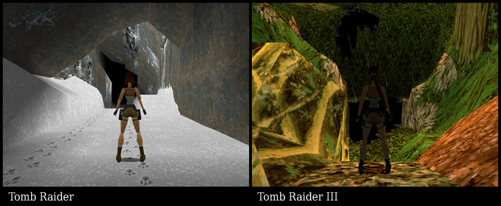
While taking screenshots of Playstation games for my emulator front end, I noticed something interesting in the Tomb Raider series. Shown here is a side by side comparison of the first moment of gameplay from Tomb Raider and Tomb Raider III. Both games use the same engine and have virtually identical graphical capability, yet TR1 looks much better.
TR1 works within the limitations of the hardware and software. They chose a cave environment, which works well with the block-and-wedge level format. Most of the textures are simple and uniform so repeating patterns are less noticable. The textures that are used for detail - such as the wolf tracks - are purposeful and compliment the scene. The character contrasts well with the background and creates a pleasing image over all.
TR3 chose a jungle environment - I guess. I can't really tell what I'm looking at. It tries to put too much information into too little texture space. There are piles of leaves, branches, ferns, rocks, god knows what. It is polygon and pixel barf. The character is back lit, making her almost the same brightness level as the background. The combined effect is that the character all but disappears into the screen.
It's easy to forget that TR1 was revolutionary when it came out, but when you play it today it still has a unique feel to it due to it's solid graphical design.
Comments
Pixl2009-12-13 23:05:01
Reminds me of society :P
Mogarf2009-12-29 01:51:14
THEY WENT BACK INTIME AND MADE TOMB RAIDER 3 FIRST.
ONO.
ONO.
dkamm652010-01-05 17:24:22
TR3 is the only one in the series that I didn't beat, only because I couldn't see what I was fucking doing.
Jimmg2010-01-07 19:48:52
TR3 - Walking in the dark.
Tc5722010-01-07 23:47:36
The TR3 graphics remind me of 3D games on the DS and all those pixely textures...
(Also since you haven't responded to my PMs, could you change my forum name from Block Builder to Tc572?)
(Also since you haven't responded to my PMs, could you change my forum name from Block Builder to Tc572?)
joksnk2010-01-26 20:22:33
kkkkkkkkkkkkkkkkkkkkkkkkkkkkkkkkkkkkkkk............
Shemp2010-01-29 19:50:09
Is it bad that I had no idea of this site's existence?
That said, you have a great ense of humor and I am impressed by your art skills. :D
That said, you have a great ense of humor and I am impressed by your art skills. :D
liam2010-01-31 10:55:51
tomb... raider?
Alex2010-01-31 12:01:00
TR1 is a much better game than TR3 because it has a sense of difficulty and you can actually see what the hell your doing and this is also why they based tomb raider anniversary because not only was the game revolutionary, it was so good that they decided to make a complete cover with better graphics, more movements, enemies etc 10 years later after they developed it
Remousamavi2010-02-18 19:11:53
Yep, it's jungle.
Usually I get the feel of being outside in a jungle environment, but yeah, TR3 didn't have that.
Usually I get the feel of being outside in a jungle environment, but yeah, TR3 didn't have that.
Tc5722010-03-04 19:37:58
Alex, the tenth anniversary of a game is always 10 years after the first one.
Unless you meant something else, but it's very hard to understand that jumbled mess you posted.
Unless you meant something else, but it's very hard to understand that jumbled mess you posted.
Badspot2010-03-04 20:36:47
He is referring to the game "Tomb Raider Anniversary" game which is a remake of the first Tomb Raider.
Alex2010-03-07 10:57:07
yeah i got that one and its brilliant and it came out in 2006 (i think) and tr1 came out in 1996 (i think)
Sephiroth2010-03-07 13:52:27
I liked the first tomb raider a lot. But at the same time I seemed to enjoy TR3 as much. And a question. What tomb raider had that one creepy butler?
Pixl2010-03-18 00:22:22
Are emulator "games" illegal :(?
Sephiroth2010-04-01 20:26:00
Are you still addicted to hentai and tacos? Same here my friend.
Mkay overlord2011-02-16 00:33:32
At one point there was a T-Rex or something I though, and it kept attacking me. Weirdest thing 2 beat.


